Staring at a blank canvas in Power BI is a total mood killer, especially when your boss wants a “data-driven” report by EOD. You have the data, but making it look professional and actually useful is where most people get stuck. This guide is here to solve that. We are diving into over 20 real-world Power BI Dashboard Examples and templates that you can use to skip the grunt work. Let’s get your reporting from “meh” to “wow” right now at Var-meta!
Finding the Best Power BI Dashboard Templates
Building from scratch is overrated. Using a Dashboard Power BI Template is the ultimate “cheat code” to start analyzing data beautifully without wasting hours on formatting.
Getting Started with Smarter Reporting
If you are looking for fresh Power BI Dashboard Ideas, think about the specific problem you are solving first. Most BI Dashboard Templates exist because someone else already faced your exact reporting nightmare.
According to Microsoft data, over 300,000 organizations use Power BI, meaning there is a template for almost every niche imaginable. Using these pre-built structures saves you roughly 60% of the time usually spent on DAX formulas and layout design.
Where to Download and Practice
You don’t need to be a pro to start. You can Download Power BI Dashboard Templates Free from various community hubs or the official Microsoft gallery. Once you have a Power BI Dashboard Examples PBIX file, just import it into your workspace and swap the data sources.
For those just starting, using Power BI Sample Dashboards or Power BI Dashboard Examples with Data already baked in is the best way to see how visuals interact. It’s hands-on learning at its best, and you get a cool report to show off immediately.
2. Sales & Marketing: Top Power BI Sales Dashboard Examples
Sales and marketing teams live and die by their numbers. Using Power BI Reports Examples helps you see exactly where the money is coming from and where it’s leaking.
Example 1: Sales Funnel Dashboard
This template helps you evaluate the effectiveness of your entire sales journey. It is perfect for spotting which stage is “choking” your revenue.
- Ideal for: Sales managers and operations teams.
- Data sources: Salesforce, Microsoft Dynamics, or Excel.
- What you’ll see on the dashboard:
- Lead volume and conversion rates between stages.
- Total opportunity value in the pipeline.
- Win/Loss ratios per month.
- Average time a deal stays in each stage.
Example 2: Sales Performance Dashboard
A deep dive into how your team is actually performing against their targets. No more hiding behind vague spreadsheets.
- Ideal for: Regional managers and individual sales reps.
- Data sources: CRM data and quota spreadsheets.
- What you’ll see on the dashboard:
- Individual sales rep leaderboard.
- Revenue vs. Target (Actual vs. Budget).
- Year-over-year (YoY) growth per product category.
Example 3: CRM Dashboard
This is a high-level view of your customer relationships. It is one of the most popular Power BI Sales Dashboard Examples because it connects directly to tools like HubSpot or Pipedrive.
- Ideal for: Business owners and CRM administrators.
- Data sources: HubSpot, Pipedrive, or Salesforce API.
- What you’ll see on the dashboard:
- Deal velocity (how fast deals close).
- Pipeline health and upcoming expiration dates.
- Customer touchpoint frequency.
Example 4: All-in-one Marketing Dashboard
Widely considered one of the best power BI Marketing dashboard examples, this one brings all your channels together. It stops you from having to log into five different platforms just to check your ROI.
- Ideal for: CMOs and Digital Marketing Managers.
- Data sources: Google Ads, Facebook Ads, LinkedIn, and Email tools.
- What you’ll see on the dashboard:
- Cross-channel ROI snapshot.
- Total ad spend vs. total revenue.
- Customer Acquisition Cost (CAC) per channel.
Example 5: PPC Dashboard
Focuses purely on paid search and display performance. It is essential for budget management.
- Ideal for: Performance marketers and agencies.
- Data sources: Google Ads and Bing Ads.
- What you’ll see on the dashboard:
- Click-Through Rate (CTR) and Cost Per Click (CPC).
- Top-performing ad sets or keywords.
- Conversion trends over time.
Example 6: Social Media Analytics Dashboard
Stop guessing what works on social media. This dashboard measures impressions, engagements, and follower growth across all networks.
- Ideal for: Social media managers and content creators.
- Data sources: Sprout Social, Buffer, or native platform exports.
- What you’ll see on the dashboard:
- Engagement rate per post.
- Follower growth trends.
- Top-performing content types (Video vs. Image).
Example 7: Customer Acquisition Dashboard
This maps the complete journey from the very first ad impression down to the final qualified lead.
- Ideal for: Growth hackers and marketing analysts.
- Data sources: GA4, CRM, and Ad platforms.
- What you’ll see on the dashboard:
- Multi-touch attribution models.
- Lead-to-customer conversion time.
- Marketing Qualified Leads (MQL) vs. Sales Qualified Leads (SQL).
Finance & Profitability: Power BI Financial Dashboard Examples
Managing money is mostly about precision. These Power BI financial dashboard examples take complex accounting data and turn it into something a human can actually understand at a glance.
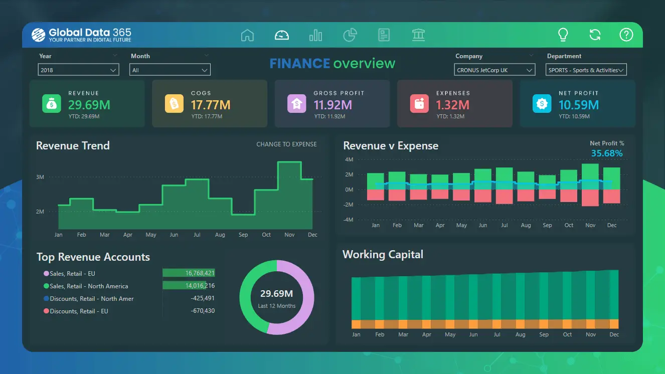
Example 8: Consolidated Financials Dashboard
A high-level view for leadership. This Dashboard Power BI Template is built for CFOs who need to see the big picture without digging through a hundred tabs.
- Ideal for: CFOs and Finance Directors.
- Data sources: ERP systems or consolidated Excel workbooks.
- What you’ll see on the dashboard:
- EBITDA, EBIT, and Net Profit margins.
- Year-to-date (YTD) revenue performance.
- Operating expense breakdown.
Example 9: Income Statement Dashboard
One of the most effective Power BI P&L Dashboard Examples featuring waterfall charts. It shows exactly how your gross revenue turns into net income.
- Ideal for: Accountants and financial analysts.
- Data sources: QuickBooks, Xero, or SAP.
- What you’ll see on the dashboard:
- Revenue vs. Cost of Goods Sold (COGS).
- Operating income trends.
- Expense variances against budget.
Example 10: Working Capital Dashboard
Liquidity is king. This dashboard helps you monitor assets and liabilities to ensure you never run into a cash crunch.
- Ideal for: Treasury managers and small business owners.
- Data sources: Bank feeds and accounting software.
- What you’ll see on the dashboard:
- Current Ratio and Quick Ratio.
- Accounts Receivable (AR) vs. Accounts Payable (AP).
- Cash on hand trends.
Example 11: Revenue Dashboard for QuickBooks
A specialized template that connects directly to QuickBooks to track 12-month sales performance.
- Ideal for: Small to medium enterprises (SMEs).
- Data sources: QuickBooks Online API.
- What you’ll see on the dashboard:
- Monthly recurring revenue (MRR).
- Profitability by product or service.
- Top customers by revenue.
Example 12: Personal Finance Tracker
A simpler version of Dashboard Power BI examples for individuals who want to treat their home budget like a business.
- Ideal for: Personal users and freelancers.
- Data sources: CSV exports from bank apps.
- What you’ll see on the dashboard:
- Spending categories (Housing, Food, Fun).
- Savings rate percentage.
- Net worth over time.
Workforce & Tasks: Power BI HR Dashboard Examples & Project Management
People are your most expensive asset. Using Power BI HR dashboard templates helps you manage headcount and project timelines without the usual headache.
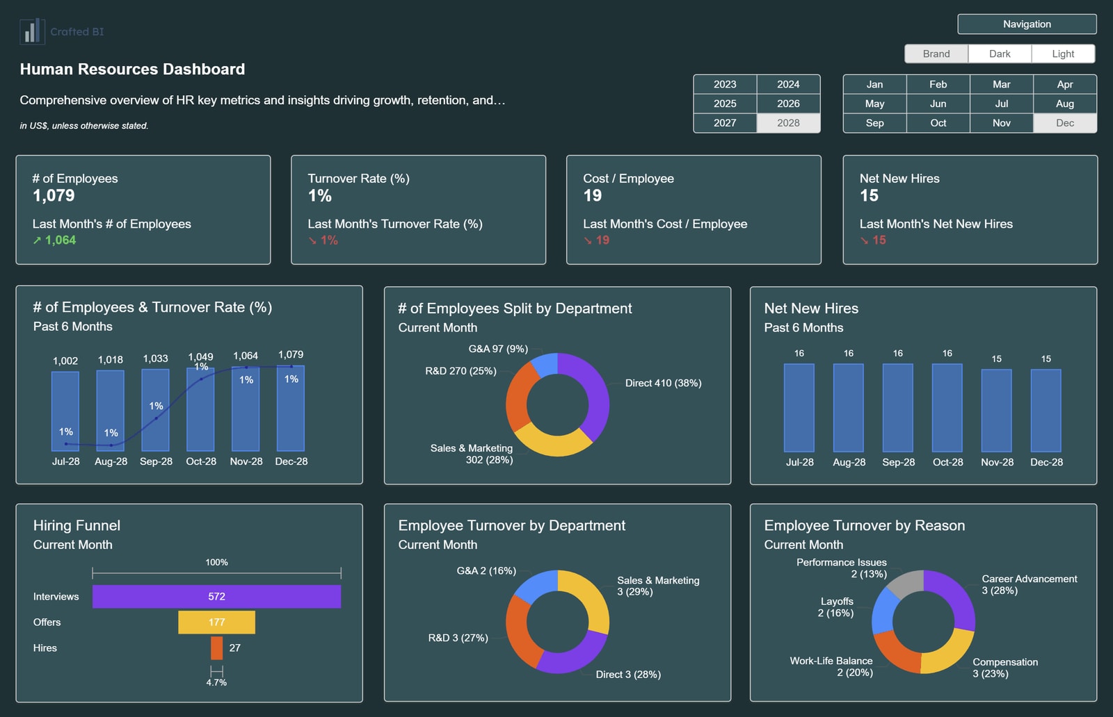
Example 13: HR Analytics & Demographics Dashboard
This is the gold standard for Power BI HR Dashboard templates. It gives you a pulse on who is working for you.
- Ideal for: HR Managers and People Ops.
- Data sources: HRIS (BambooHR, Workday, etc.).
- What you’ll see on the dashboard:
- Total headcount and new hires.
- Diversity and inclusion (D&I) metrics.
- Average salary per department.
Example 14: Employee Retention & Turnover Dashboard
Predict who might leave before they actually quit. It segments exits to identify “toxic” departments.
- Ideal for: Senior leadership and HR strategists.
- Data sources: Exit interviews and tenure data.
- What you’ll see on the dashboard:
- Turnover rate (voluntary vs. involuntary).
- Average employee tenure.
- High-risk attrition groups.
Example 15: Project Management Dashboard
A comprehensive Power BI project management dashboard template for tracking everything from deadlines to team burnout.
- Ideal for: Project Managers (PMs) and team leads.
- Data sources: Jira, Asana, or Monday.com.
- What you’ll see on the dashboard:
- Task completion percentage.
- Overdue tasks by owner.
- Milestone progress bars.
Example 16: IT Spend & Resource Dashboard
A specialized power BI project management template to keep an eye on technical project costs.
- Ideal for: CTOs and IT Project leads.
- Data sources: Cloud billing (AWS/Azure) and timesheets.
- What you’ll see on the dashboard:
- Planned vs. Actual project costs.
- Resource allocation (who is overbooked).
- Infrastructure spend trends.
Example 17: Time-tracking Dashboard
Connects to time-tracking software to measure how much of your day is actually billable.
- Ideal for: Agencies and consultants.
- Data sources: Harvest, Toggl, or Clockify.
- What you’ll see on the dashboard:
- Billable vs. non-billable hours.
- Utilization rate per employee.
- Profitability per client project.
Industry-Specific Metrics: Power BI KPI Dashboard Examples
Generic reports don’t work for everyone. These BI Dashboard Examples are tailored for specific operational needs.
Example 18: Manufacturing Operations (OEE) Dashboard
For the factory floor. It tracks Overall Equipment Effectiveness (OEE) and why machines are sitting idle.
- Ideal for: Plant managers and engineers.
- Data sources: IoT sensors and production logs.
- What you’ll see on the dashboard:
- Availability, Performance, and Quality (APQ).
- Downtime reason Pareto chart.
- Defect rates per batch.
Example 19: Logistics & Supply Chain Dashboard
Visualize product flow across the globe. Essential for avoiding shipping delays.
- Ideal for: Supply chain managers and logistics leads.
- Data sources: ERP and shipping carrier data.
- What you’ll see on the dashboard:
- On-time delivery (OTD) percentage.
- Shipping costs by carrier.
- Order fulfillment cycle time.
Example 20: Inventory Analysis Dashboard
Stop overstocking items that don’t sell. This monitors turnover and aging stock.
- Ideal for: Retailers and warehouse managers.
- Data sources: Inventory management systems (WMS).
- What you’ll see on the dashboard:
- Stockout risk alerts.
- Inventory turnover ratio.
- Dead stock value.
Example 21: Healthcare Analytics Dashboard
One of the best Power BI Healthcare Dashboard Examples for tracking patient outcomes and hospital capacity.
- Ideal for: Hospital administrators and clinical leads.
- Data sources: Electronic Health Records (EHR).
- What you’ll see on the dashboard:
- Patient wait times.
- Bed occupancy rates.
- Readmission rates.
Ready to Build Your Own?
Data is only powerful if you can actually read it. Whether you are using Power BI Sales Dashboard Examples or deep-diving into Power BI HR Dashboard Templates, the right start makes all the difference.
If you’re feeling overwhelmed or need a custom solution that fits your business like a glove, Contact Varmeta today. We specialize in turning messy data into beautiful, actionable dashboards. Let’s make your data work for you!
FAQs
1. Can I get a Power BI Dashboard Template for free?
Yes. You can Download Power BI Dashboard Templates Free from the Microsoft Community Gallery or specialized sites like Numerro. Most basic versions are free to get you started.
2. How do I use a Power BI Dashboard Examples PBIX file?
Simply open Power BI Desktop, click “File,” then “Open,” and select the .pbix file. You’ll need to “Change Data Source” to connect it to your own Excel or SQL database.
3. Are Power BI Sample Dashboards good for learning?
Definitely. Using Power BI Sample Dashboards is the fastest way to understand how complex DAX calculations work in a live environment.
4. What is the difference between a report and a dashboard?
In Power BI, a report is a multi-page document with detailed data, while a dashboard is a single-page “high-level” view (usually created in the Power BI Service).
5. Can I customize these BI Dashboard Templates?
Absolutely. Once you have the template, you can change colors, fonts, and visuals to match your brand.