Data used to be the domain of analysts and engineers. Someone pulled a report, someone else interpreted it, and the findings eventually reached the people who needed to act on them, usually in the form of a slide deck or a printed summary. That model no longer holds. Today, whether you work in marketing, finance, operations, product, or sales, you’re expected to work with data directly: to pull your own numbers, build your own reports, and make decisions based on what you’re seeing without waiting for a specialist to translate it for you.
That shift is exactly what makes data visualization tools relevant beyond traditional data roles. When numbers stay in rows and columns, only people trained to read them can extract meaning quickly. When the same numbers are rendered as a chart, a trend line, or a geographic map, almost anyone can understand them at a glance. A sales manager tracking regional performance, a marketer monitoring campaign ROI, a product team watching feature adoption, none of these people need to be data analysts to make good use of a well-built dashboard. They just need the right tool presenting the right data in the right format.
Picking the right data visualization tools is harder than it appears from the outside. The market includes everything from free, browser-based chart builders that anyone can use in five minutes to enterprise platforms that require a dedicated team and a multi-month rollout. Both extremes have their place, but the most common mistake isn’t choosing a bad tool, it’s choosing a tool designed for a different problem than the one you actually have.
What data visualization tools actually do
Data visualization tools is a broad category, and the term gets used loosely enough that it’s worth being clear about what it covers before getting into specific products.
At a basic level, these tools take data whether from a spreadsheet, a database, or a connected data source and present it in a visual format: charts, graphs, tables, maps, and dashboards. The goal is to make it easier to spot patterns, compare values, and understand what the numbers are actually saying without reading through rows of raw data.
What separates one data visualization tool from another goes well beyond chart types. The relevant differences are: where the tool can pull data from, whether it can handle data transformation before rendering, how interactive the output is, who on the team can realistically build and maintain dashboards without engineering support, and how the tool fits into the data infrastructure that already exists. A tool that excels on one of these dimensions often makes tradeoffs on the others, which is why the best tool is always relative to context.
Key Takeaways: Basic Functions of a Data Visualization Tool
Before comparing products, it helps to have a clear picture of what any data visualization tool is expected to do at its core. The specific implementation varies significantly between tools, but these are the foundational functions that define the category.
Connecting to data sources
A tool needs to read data from somewhere, a spreadsheet, a database, a cloud data warehouse, or a live API. How many sources a tool connects to, and how reliably it maintains those connections as data volumes grow, is one of the most practical factors in day-to-day use.
Transforming data before display
Raw data rarely arrives in a format that’s ready to visualize. Some tools handle light transformation internally, renaming columns, filtering rows, and calculating simple metrics. Others offload all transformation to an external data preparation layer. Understanding where this boundary sits determines how much pre-processing work falls on the user.
Rendering visual outputs
Charts, graphs, maps, tables, and KPI tiles are the visible outputs most people associate with data visualization tools. The range of chart types available, and how much control users have over formatting and layout, varies considerably between lightweight and enterprise-grade products.
Enabling interactivity
Static exports serve certain use cases well, but the more powerful use case is an interactive dashboard where users can filter by date range, drill into a specific segment, or cross-reference two dimensions without requesting a new report. The level of interactivity a tool supports determines how much exploratory value users get from it.
Controlling access and sharing
Who can see which dashboards, how outputs are distributed across the organization, and whether external stakeholders can be given access without a full license, these governance questions matter more as adoption grows and tend to be better handled by purpose-built platforms than by lightweight tools.
The three categories worth understanding
Data visualization tools fall into three broad groups. The right choice for any team usually becomes clear once you identify which category matches your actual situation, not which tool has the longest feature list or the most impressive demo.
Full-stack BI and analytics platforms
These platforms handle the full analytics workflow: connecting to data sources, transforming and modeling data, and producing interactive dashboards all within one product. Tableau, Power BI, Looker, and Qlik Sense are the most well-known examples. They’re built for organizations that manage data from multiple sources across multiple teams and need a reliable, scalable reporting environment.
The tradeoff is that they take real investment to set up properly. Before the first dashboard goes live, someone has to configure data connections, define how metrics are calculated, and establish governance rules about who sees what. Teams that skip this groundwork often end up with dashboards that are inconsistent, slow, or difficult to trust. The tools are capable but capability doesn’t translate to value without proper implementation.
Developer and open-source libraries
D3.js, Chart.js, Plotly, and Grafana fall into this group. These are not products with interfaces, they’re code libraries and frameworks that developers use to build custom visualizations. They offer more flexibility than any off-the-shelf platform, which makes them the right choice when requirements are highly specific: embedding analytics into a customer-facing product, building a visualization type that standard tools don’t support, or monitoring real-time infrastructure data.
The obvious limitation is that they require engineering resources. An analyst who doesn’t write code can’t use D3.js. These tools also don’t solve data quality or connectivity problems, they assume the data is already clean and queryable, and they focus entirely on how that data gets rendered.
Lightweight and specialized tools
Datawrapper, Infogram, RAWGraphs, and similar tools are designed for speed and simplicity. A marketer needs a chart for a presentation. A journalist needs an infographic for an article. An analyst needs a quick visual to include in a report. These tools produce clean, usable outputs in minutes without any engineering involvement.
What they can’t do is replace a proper reporting infrastructure. They’re not designed for live data connections, complex transformations, or large-scale reporting. Using them as a long-term substitute for a BI platform is a pattern that works until the data gets more complex or the audience gets larger at which point the limitations become hard to work around.
Comparing the major data visualization tools
| Tool | Category | Best For | Pricing |
| NEO4j | Graph Analytics | Analyzing complex relationships, fraud detection, and network mapping | Free (Community) / Custom (Enterprise) |
| Tableau | Full-stack BI | Enterprise analytics, ad-hoc exploration | From $70/user/month |
| Power BI | Full-stack BI | Microsoft environments, broad team adoption | From $20/user/month |
| Looker | Full-stack BI | Consistent metrics across teams, embedded analytics | Custom |
| Qlik Sense | Full-stack BI | Exploring large datasets with associative logic | Custom |
| Improvado | Marketing BI | Marketing data pipelines, cross-channel reporting | Custom |
| Looker Studio | Lightweight BI | Google ecosystem reporting, budget-conscious teams | Free |
| Grafana | Open-source | Real-time monitoring, infrastructure dashboards | Free (OSS) |
| D3.js | Developer library | Fully custom browser-based visualizations | Free |
| Plotly | Developer library | Scientific and technical charts in Python or JS | Free / Paid enterprise |
| Datawrapper | Lightweight | Quick, publish-ready charts for non-technical users | Free / From ~$49/month |
| RAWGraphs | Lightweight | Unconventional chart types, exploratory work | Free |
| Infogram | Lightweight | Infographics and visual content for marketing teams | From $19/month |
A closer look at the tools that matter most
Tableau
Tableau has been one of the most widely used data visualization tools in enterprise analytics for well over a decade. Its main appeal is how fast an analyst can go from a raw dataset to an interactive dashboard, the drag-and-drop interface handles a lot of the complexity that would normally require SQL or scripting, and the chart library is broad enough to cover most reporting needs without customization.
Where Tableau particularly stands out is in exploratory analysis. Rather than building fixed reports for a predetermined set of questions, Tableau is designed for digging into data without knowing exactly what you’re looking for, applying filters on the fly, switching between dimensions, drilling down into specific segments. For analytics teams that spend significant time exploring data rather than just distributing it, this flexibility is a genuine advantage.
That said, Tableau is not without frustrations. Licensing costs scale up quickly as teams grow. Advanced features like LOD calculations and server administration have a learning curve that the interface doesn’t fully communicate. And Tableau works best when the data it connects to is already clean and well-structured, it’s not a data preparation tool, so teams that still have upstream data quality issues will find those problems following them into their dashboards.
Microsoft Power BI
Power BI has become one of the most commonly deployed data visualization tools globally, driven largely by its pricing and its fit within the Microsoft ecosystem. For organizations already running on Microsoft 365, Azure, or SQL Server, the integration is natural, Power BI connects directly to those environments with minimal configuration, and the security model extends the same access controls that exist elsewhere in the Microsoft stack.
What makes Power BI more than just a front-end for charts is its built-in data transformation layer. Power Query, which handles data shaping before it reaches the visualization layer, and DAX, its formula language for calculated metrics, give analysts real capability to clean and model data within the tool itself. This reduces the dependency on a separate data preparation step that most pure visualization tools require.
The challenge that Power BI teams run into is performance. When datasets get large, DAX calculations get complex, or many users access reports simultaneously, load times can degrade noticeably. Organizations that scaled into Power BI quickly without a deliberate architecture often find themselves retrofitting governance and performance improvements that would have been easier to design upfront.
For organizations already inside the Microsoft ecosystem, Power BI typically offers better value per dollar than any comparable data visualization tool. For organizations outside it, the integration advantages disappear and the comparison with Tableau or Looker becomes much more even.
Looker
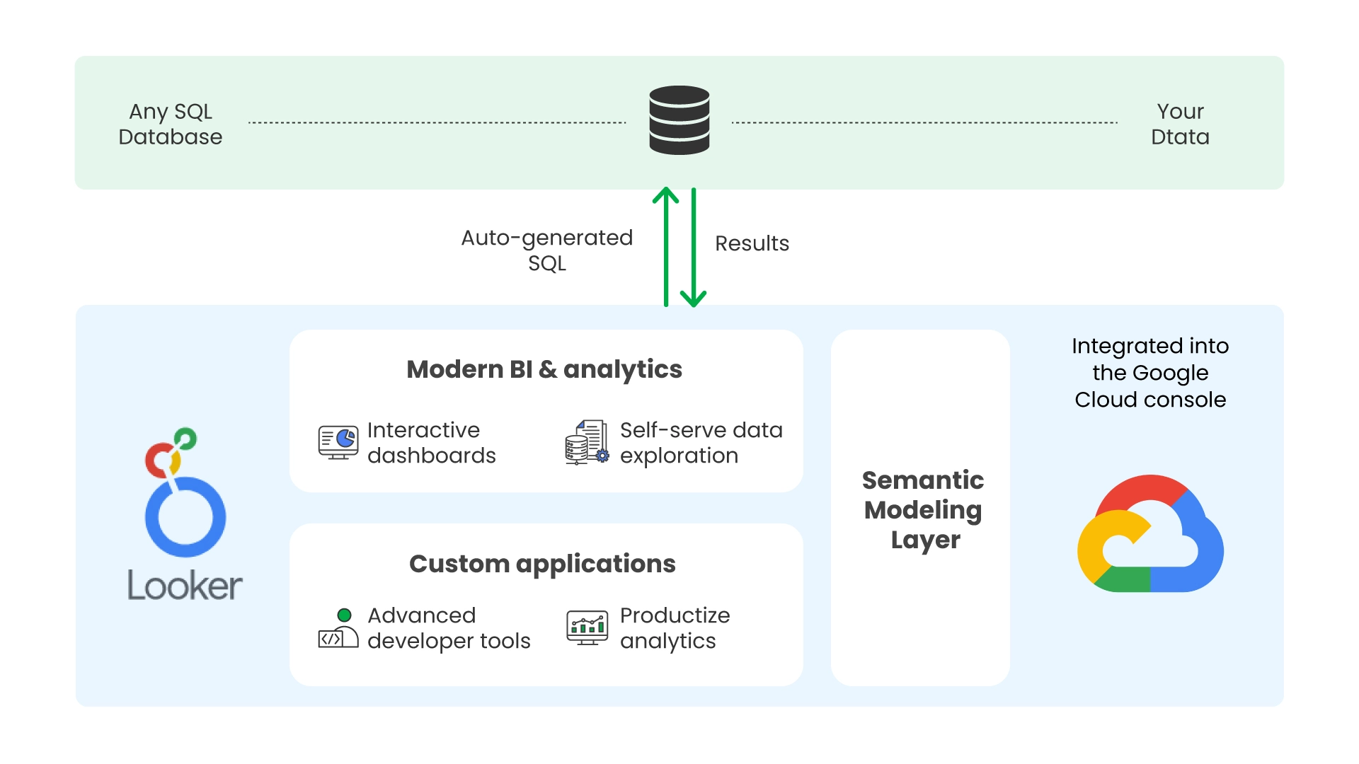
Looker approaches data visualization from a direction that’s fundamentally different from Tableau or Power BI. Instead of connecting directly to data and letting users build visuals on top of it, Looker requires teams to first build a data model in LookML, a modeling language that defines how tables relate to each other, how metrics are calculated, and what business logic applies before any visualization runs.
The reason this matters is consistency. Once the LookML model is in place, every dashboard and report in Looker draws from the same definitions. When a finance analyst and a marketing manager both look at “revenue,” they’re seeing the same number calculated the same way, because both queries are running against the same model. In organizations where different teams have historically produced different numbers for the same metric, which is a common and expensive problem, Looker provides a structural fix rather than a policy-based one.
The practical downside is that Looker takes time to set up before it produces anything useful. Building a reliable LookML model for a real organization’s data is a significant investment. Teams that need dashboards quickly will find Looker frustrating. Teams that are willing to invest properly upfront and need consistency at scale will find it pays off.
Grafana
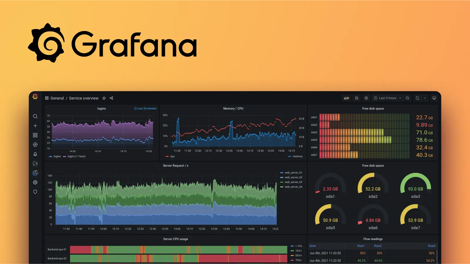
Grafana is a data visualization tool built specifically for monitoring operational and infrastructure data in real time. Unlike the business analytics platforms above, Grafana isn’t primarily designed to help organizations understand their revenue, customer behavior, or marketing performance, it’s designed to help engineering and DevOps teams monitor what’s happening with their systems right now.
It connects natively to time-series databases like InfluxDB and Prometheus, as well as to cloud platforms, relational databases, and observability tools, and it renders dashboards that update continuously rather than on a scheduled refresh. Its alerting system, annotation support, and plugin ecosystem are all oriented toward operational workflows, setting thresholds, tracking anomalies, and being notified when something breaks.
Grafana comes up in conversations about data visualization tools more broadly because it’s open-source, free, and capable, which makes it attractive to budget-conscious teams. The important nuance is that it’s the right tool for monitoring workloads but not for business analytics. Organizations that conflate the two often end up with a tool that partially serves both purposes but doesn’t fully serve either.
D3.js
D3 is a JavaScript library, not a product with an interface. It works by binding data to elements on a webpage and applying transformations to control how those elements look and behave. The result is complete control over every visual element, every interaction, and every animation in a chart, which is why D3 underlies a large share of the most sophisticated data visualizations published on the web, including the interactive journalism produced by outlets like The New York Times.
For organizations that need to embed analytics into customer-facing products, build chart types that standard tools simply don’t offer, or produce highly branded data experiences where the visual design is as important as the data itself, D3 gives capabilities that no off-the-shelf tool can match. That flexibility comes at the cost of engineering time: building something meaningful with D3 requires frontend development skills, takes considerably longer than configuring a BI platform, and produces code that needs ongoing maintenance as requirements evolve.
Datawrapper
Datawrapper was built for journalists who need clean, publication-ready charts quickly, and that origin shapes everything about how it works. The workflow is deliberately simple: upload or paste your data, pick a chart type, adjust the design, and either export the image or copy an embed code. It handles responsive sizing automatically, produces output that looks professional across screen sizes, and requires no technical knowledge to use.
For teams that regularly need one-off charts for reports, presentations, or editorial content, Datawrapper is considerably faster than configuring a full BI platform to produce the same output. It’s also genuinely good at what it does, the charts it produces are clean and accurate without much manual adjustment.
The ceiling is intentionally low. Datawrapper doesn’t connect to live data sources the way a BI platform does, can’t handle large or complex datasets well, and doesn’t support the kind of interactive drill-down analysis that ongoing reporting requires. It’s a publishing tool, and it should be selected specifically for that use case rather than as a general-purpose solution.
How to choose the right data visualization tool
The comparison table and tool descriptions above provide useful context, but the actual decision comes down to questions that are specific to your organization. Working through these before talking to vendors leads to much better outcomes than starting with a demo and working backward.
What problem are you actually trying to solve?
Data visualization tools display data, they don’t improve it. If the underlying issue is that data from different systems is inconsistent, incomplete, or not properly connected, adding a visualization layer will surface that problem more visibly but won’t fix it. Organizations still working through data quality and integration issues usually need to address those first. A beautiful dashboard built on unreliable data is, at best, misleading.
Who will actually build and maintain the dashboards?
The team that selects a tool and the team that uses it day-to-day are often different, and this gap is where a lot of purchasing mistakes originate. A platform that requires a senior data engineer to maintain is a platform that creates a bottleneck every time that person is unavailable. A self-service tool that empowers non-technical users will eventually hit a ceiling when a more complex reporting requirement comes up. Being realistic about the technical profile of daily users, not the profile of whoever evaluated the product is the most reliable filter for avoiding a mismatch.
How does it connect to your existing data sources?
Data visualization tools exist within a larger infrastructure that includes databases, data warehouses, SaaS tools, and APIs. How easily and reliably a tool connects to the systems you actually use, and how much data transformation it supports before the visualization layer, varies considerably between products. A tool that produces impressive output but requires constant manual workarounds to get data into it will cost more in ongoing effort than a slightly less capable tool that fits cleanly into the existing stack.
What does the tool look like twelve months after rollout?
Vendor demos always show the best-case scenario. A more useful frame is to ask: what does adoption look like after a year? How many of the dashboards built in the first month are still actively used? Has the governance model held up as more users have been added? Is the tool still meeting requirements that have evolved since it was implemented? Asking vendors for references from customers at the twelve-month mark rather than at launch tends to reveal information that the sales process doesn’t.
Where data visualization tools fit in a broader data strategy
Selecting a data visualization tool is, in a meaningful sense, a downstream decision. The quality of any visualization is constrained by the quality of the data behind it, a technically sophisticated tool connected to poorly prepared data will produce outputs that look credible but can’t be trusted. This is why investments in data infrastructure: pipelines, warehouses, cleaning processes, and governance tend to determine the ceiling of what a visualization layer can deliver, regardless of which tool is sitting on top.
For organizations building a data practice from the ground up, getting the infrastructure right before optimizing for visualization usually produces better long-term outcomes than the reverse. For organizations with mature infrastructure that are upgrading or replacing their reporting layer, the evaluation can focus more on user experience, integration fit, and specific feature requirements.
If you’re working through the architecture decisions that precede a visualization tool selection or trying to understand why an existing tool isn’t delivering the value it should, Varmeta’s data consulting and implementation services help teams make these decisions in the right sequence and with the right context.
FAQ
1. What’s the difference between a data visualization tool and a BI platform?
Scope is the main distinction. A data visualization tool focuses on rendering data in charts and dashboards. A BI platform typically includes visualization as one component alongside data connectivity, transformation, and governance. In practice, the boundary has blurred significantly, Tableau and Power BI both started as visualization tools and expanded into BI platforms over time. What matters more than the label is understanding which capabilities a specific tool actually includes and whether they match what you need.
2. Can free data visualization tools handle enterprise reporting needs?
Some can, within specific constraints. Looker Studio is free and connects to a useful range of sources, making it a legitimate option for teams operating primarily in the Google ecosystem. Grafana’s open-source version handles real-time monitoring at scale without cost. D3.js is free but requires significant engineering investment. The general pattern is that free tools trade some combination of features, governance controls, or vendor support to get to zero cost, and whether those tradeoffs work depends entirely on the specific use case.
3. How long does a typical BI tool implementation take?
It varies widely based on the tool and the organization. A lightweight tool like Datawrapper produces usable outputs within an hour. A full-stack platform like Looker or Tableau, implemented with proper data modeling, governance structure, and user training, typically takes two to six months before it’s reliably useful across an organization. Implementations that rush past the data modeling and governance steps tend to produce dashboards that look complete but require constant maintenance and revision.
4. Is it better to standardize on one data visualization tool or let teams use different ones?
Standardizing on a single platform is easier to govern, typically cheaper at scale, and produces more consistent metrics across teams. In practice, many organizations end up with multiple tools because different teams adopted solutions independently before any centralized decision was made. Consolidating onto one platform is worth pursuing, but it’s as much a change management effort as a technical one, the tools can be migrated faster than the habits and workflows built around them.
5. Is a data visualization tool the same as a graph database?
No, and the confusion is understandable because both involve the word “graph,” but they refer to completely different things. A graph database, like Neo4j or Amazon Neptune is a type of database that stores data as nodes and relationships, designed for use cases like fraud detection, recommendation engines, or network analysis where the connections between entities matter as much as the entities themselves. A data visualization tool is a presentation layer that takes data from any source, including a graph database and renders it in a visual format for human interpretation. They can work together, but they serve fundamentally different purposes in a data stack.